Site Archive
A little about Stargze's past layouts.
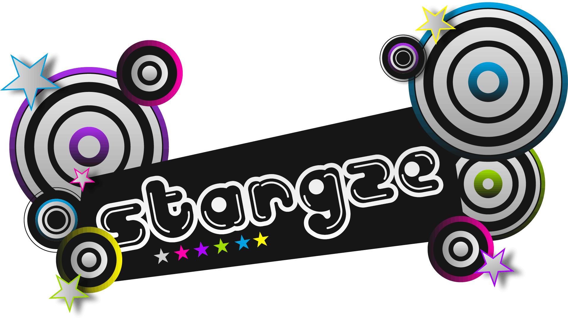
Retro Wannabe
This is Stargze’s first official layout. A layout that didn’t last very long, which says a lot about how little I liked it.
Since December 2025, I’d been thinking about creating a page here on Neocities, so as soon as the new year arrived, I started creating this layout.
I honestly don’t know what happened with this layout; I call it Retro Wannabe because I think I looked too much at other Neocities sites that also have an old-school vibe, which is a bit silly because I wasn’t even around during the Web 1.0 era.
This layout isn’t that bad, but I feel like it has a lot of unnecessary stuff, like the splash page, which didn’t add anything. I don’t remember where I put the other HTML files for this layout, but there were pages that looked like endless menus—you’d click something and it would immediately send you to another menu, lol.
The colors are the only thing I’d keep, but they’re very pastel and strained my eyes. Plus, I used Times New Roman, which I like too, but I wouldn’t say it’s my favorite font—though I guess it gave off that retro vibe, right? lol
I remember I used Zonelets as a blog, and one day it just decided to stop working, so I had to rush to organize everything with <details>—I like that tag, just not for writing my blog. Plus, I was using it inside an iframe, and reading things inside an iframe can be tricky, oh dear! The thing is, it was very disorganized and the navigation was terrible.
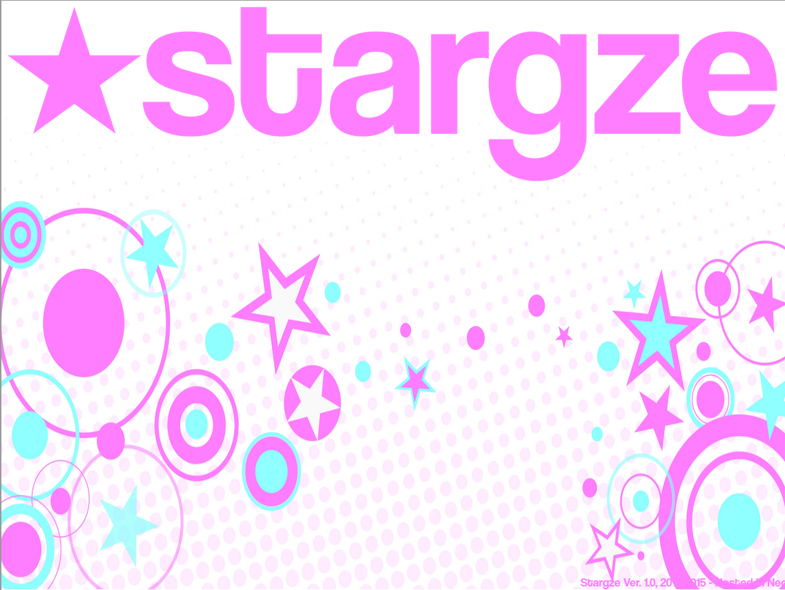
Magic To Go To My Star
“Magic To Go To My Star,” like Lee Jung Hyun's album. It's an album I listened to a lot while creating the layout—plus, both feature purple, are maximalist, and have stars.
After the failed layout of version 1.0, I decided to make something worthwhile—for myself, of course—something I’d really like.
So I thought about creating something nostalgic for me, but something I could actually remember, so I considered various ideas, like, “If I’d had the chance to make a website as a kid in the 2010s, how would I have done it?” That’s how this layout was born. I think by asking myself this question, I was able to connect with something that felt nostalgic yet authentic to me. Plus, when I was working on it, I really immersed myself in the process—I sat in front of my laptop every day, barely looking at Neocities or the internet in general. I think this helped me create my site without any outside influence, or at least very little—just me and what I love.
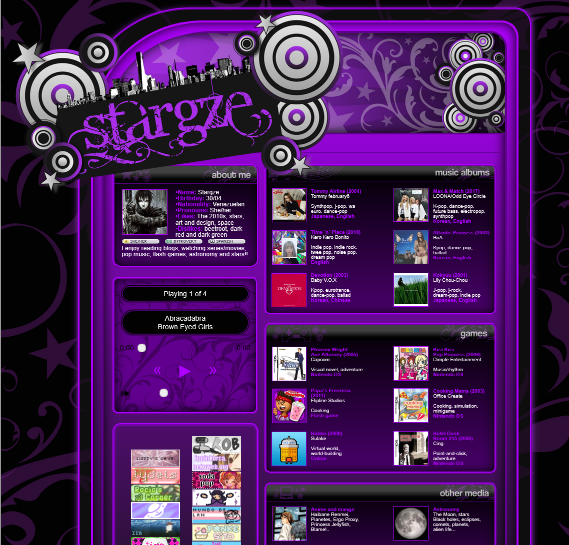
I think this layout is beautiful; I think it’s one of my favorites out of all the ones I’ve made, and this is just the index page. However, there are flaws, of course. Before updating to the current version of the layout, I wanted to use “Magic To Go To My Star” as the layout for everything—I wanted to use that stylesheet for the entire page. However, the font is too small; if I made it bigger, it would end up breaking other elements. Plus, there’s way too much purple—I’m sure that would have ended up straining my eyes as well. For a page you only look at once, it’s fine, but for many pages, I don’t think it would have worked.
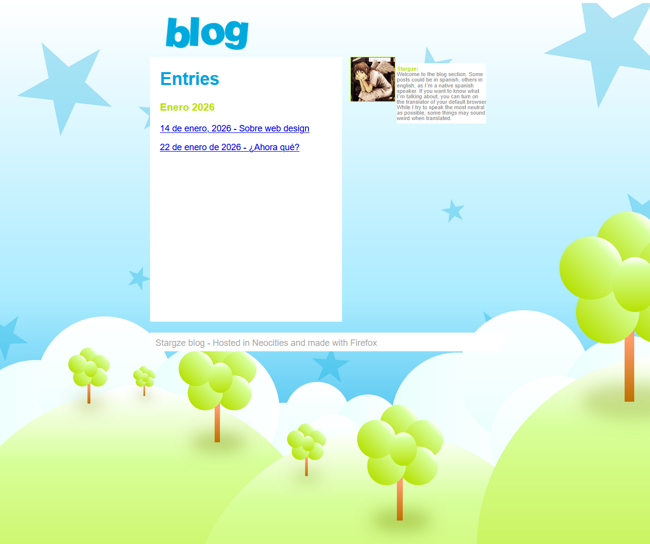
And this was the blog section. This one really surprised me—it turned out so well, especially since I made it in just one day. I liked it just as much as the index page. I know, I’m a huge fan of my own layouts, but I think they turned out really nice. Unfortunately, I used iframes here too—it’s a shame, but it was still worth it.